Our world of digital design has shifted over to click-and-move action. Apart from Color, Shape, Balance and Contrast, Font is the very first decision that leads the eye of viewers to the next stage after a rapid click. Still repeating the same fonts for all projects? Or do you feel you’re going round in circles searching for the perfect font? You’ve come to the right place.
In this article, we present to you the best practices for pairing fonts, with a focus on 4 criteria that could influence your designs this year!
- Readability
- Clarity
- Contemporary feel
- Cool look
Before we start, think of why you are going to pair fonts! Because some types of fonts easily show their characters without you having to think long and hard. Others offer no story or message unless they appear with a clever combination. According to your purpose, for headline, subtitle, body text or functional design, you can use our best practices to suit your specific needs.
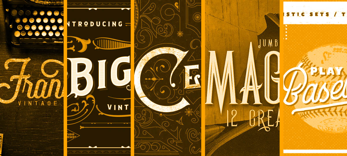
#Practice 1. Combine Sans Serif and Serifs

An easy combination formula for font is to pair Serif and Sans Serif. Both fonts are still under an ongoing debate as to which one is more readable. Here’s a brief explanation: Serif has feet as the top and bottom while Sans Serif is without feet. (Sans in French means “without”). Compliment or contrast but never conflict is the strong point of this combination.

It’s commonly agreed that Sans Serif is slightly more readable compared to Serif in web design. As it turns out, Serif have more readability than other typography relating to printed works.

It seems like a poor choice when combining similar classifications. For example pairing Sans Serif with another Sans Serif, or a Serif font with another Serif font. It’s because you don’t get enough contrast and will very probably end up with conflicting visuals that won’t be easy on the eye. Also it likely makes your design pretty bland and look undifferentiated.
#Practice 2. Combine Sans Serif and Script


If you are looking for a combination which could give your brand a strong voice, this combination is always a go-to choice. A perfect harmony is birthed here with the mosaic between modernism from Sans and freedom and smooth from a Script font.


You definitely can switch your style both ways: Luxury or Friendly with font duos.
#Practice 3. Understanding Typographic Hierarchy is more important than ever

Hierarchy in Typography here is simply how you implement the contrast font sizes and font weights in visual design in order to get enough different and make your content approachable.
And understanding Typographic hierarchy is more important than ever.
One person will receive 174 newspapers on average. Readers always have to scan million informations everyday before they read or they choose not to read. Hence bringing order to chaos is what typographic hierarchy is all about.
Based on a research by Dr. Martin Hilbert

How to start? Set three levels of Typography hierarchy.
- Typography Level 1: For the most important information, make it immediately visual in overall. Make your font bold and let it go big.
- Typography Level 2: For helping organize information into sections, make it clear enough to navigate direct guide for Typography Level 3.
- Typography Level 3: For the heavy text, make it simple and easy to read once it is considered to be the smallest size compared to these level above.
Why? Remember that most people read from left to right, top to bottom. So starting with big size in the header and decrease in size when it reaches to the body text. 😉
For more details, here are some typical factors that could give you a real practical implement in typographic hierarchy.
Size

Giving your design enough contrast in size makes it so much easier for readers to distinguish what is most important. It’s a pretty big change!
Case

For caps, don’t apply it in your whole design because it reduces readability. It’s like you’re shouting messages at your viewer. Using all caps wisely can generate the right attention.
Weight

Make it bold when you need some text to be highlighted. Make it lighter when you want to make it a lesser important order.
Alignment

Based on our brain’s mechanism, putting a picture on the right and the small body text on the left makes it easier to get attention. So the trick here is to visualize your big sized text as an image. Now you’ve nailed how we arrange the text to get alignment! 😉
Spacing

It’s important to have white spaces once you want to establish a strong hierarchy. Spacing always works well to know which content is going together and which one is separated.
So many things in typographic hierarchy allow designers to apply new approaches to their design and create a unique style specific to their capabilities.
A good hierarchy for Spacing by Sant:

Take some creative cues from these elements above! Your design will look very well organized and attractive.

#Practice 4. Stick to 2-3 fonts maximum


The simpler it is, the easier for our brains to grasp a brand’s message. If you mix many fonts in one design, it ends up looking strange and overly complicated. 2 font combinations are always perfect for branding and quotes!
#Practice 5. Don’t break the mood


Don’t make the mistake of mixing fonts which aren’t meant to be a pair. It really boils down to the style you’re going for. Try out to combine modern with modern, vintage with vintage, etc. Once you create a proper mood combo, your design will be perfect.
#Practice 6. Keep it simple

You hear “Keep it simple” millions of times but actually knowing what’s simple and what’s more than simple is a skill. In The Laws of Simplicity, John Maeda offers ten laws for balancing simplicity in business, technology, and design. One thing to consider is when you use less you are actually getting more.
Conclusion
In this vast design field, you will never get a chance to apply a bigger role in your story than by picking a perfectly-matched typography pair. As everyone says, a typeface tells your story. Practice makes perfect! If you’re looking for a quicker way, this tool provides the best font combinations. You can customize your font based on the categories.