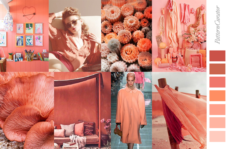
Every December, Pantone will announce a selected color for the next coming year. And its 2019 selection, Living Coral 16-1546 was chosen for its rich history. People call it like the color of Nature, of Home and of Awakenings. Discover the story behind the color with us through 3 main visual forms: Fashion, Makeup and Graphic Design. Get inspired by how designers incorporate this color into their creations all over the world.

Why Living Coral?
There’s always an interesting reason behind Pantone’s chosen color. Greenery was 2017’s color of the year due to a rising trend – designers had an innate craving to immerse themselves in the physical beauty and inherent unity of nature.
“Yes, Living Coral is indeed a shout out to the reefs around the world that are dying off in warming seas. In the Great Barrier Reef alone, one 2016 bleaching event killed almost 30 percent of shallow-water corals. Does that make you sad? Wrap yourself in the big, comforting hug of the color those graying coral skeletons used to be!”
Pantone’s Vice President Laurie Pressman explains why they chose Living Coral for 2019.

If half of 7.7 billion people around the globe start searching about why Pantone’s Living Coral color was chosen, chances are they’ll be more exposed to conservation issues in the ocean. Hopefully, this in turn will increase worldwide awareness of coral reef extinction.

Fashion & Makeup Meets Living Coral
As a trend, more and more big brands start releasing their collections or campaigns relating to this color. Are you a store owner? Be a trendsetter! Even something as simple as changing the background color of your product’s showcase with shades of Living Coral can boost your sales. The result? Potential customers feel like your products are on trend and excitement is generated. Your customers will then take the next step to explore your products and possibly convert into buyers.

This year’s vibrant between-pink-and-orange Pantone shade is infused with a feeling of upbeat, modern energy. Be color-savvy by mixing and matching it with yellow, blue or green hues if you want a harmonized visual. Want to make a statement? Choose Living Coral colors. It sparks a balance of feminine energy and warmth in both fashion and makeup trends.


Leveraging Living Coral in Graphic Design
Proving that it’s not just for fashion and makeup, Living Coral also makes a huge, dramatic impact on graphic design trends. From visual designs to product packaging, this color of the year is taking over by humanizing visuals with a spirited feeling. Predictably, this trendy color could change the mood of 2019 with an optimistic feel for joyful design pursuits.

Jump on trend with these 4 ideas below that are curated to spark inspiration! Start rocking Living Coral colors in your designs now.
Choose Living Coral Elements
The truth is, you can change a graphic element’s color with any design software, but unfortunately, this trick doesn’t apply for every texture, particularly the watercolor or wall effect. Consider choosing a graphic element that is originally in a relevant Living Coral shade. It will be easier to merge into your designs, and will look seamless (as opposed to you trying to edit the colors from the original hue).


Use Living Coral In Your Color Scheme
Catch the trend train by applying Living Coral shades for your website or brand color scheme. Good news, if you’re not a master in web design, right now you can set up the color scheme for your social media channels, particularly Twitter. Your call-to-actions will stand out and generate more eyeballs with your audience.
Also, don’t forget that you have full control of setting your avatar and cover in your social media platforms. Get more impressions by playing around with trending colors and post it!

Feature The Colors In The Background
Why not feature the trendiest colors as your background and see how strong an impression it makes. It’s a psychological theory that this color promotes feelings of intimacy, generates engagement and sociability.

And so, even if your product doesn’t have much relation to the color, that doesn’t mean you shouldn’t make use of it. Try slapping on a Living Coral background today 😉


In short, other than fashion and makeup, set your designs on fire by:
- Choosing Living Coral colored design elements
- Using Living Coral in your design’s color scheme
- Featuring Living Coral shades as your design background
Keep checking back for more trend inspiration. What’re you waiting for? Start rocking Living Coral colors in your designs now!

Source: Linh Pham