Summer – the season of fun in the sun, picnics, exploring the sand and sea, and … incredible music festivals. What if you’re a visual creator in need of some design inspiration to create visuals for these summer moments? Say no more – our 3D content can fulfill all your creative aspects.
Visual design has had a flat focus in the past years, but this year we see a definite rise in 3D and gradients making a comeback. The 3D gradient has been a steadfast feature of the illustration scene for the last year or so, and they’re not disappearing any time soon.
However, in 2019 we’ll start to see more considered approaches to gradients in illustration, with gradients being more of an integral feature of images rather than the standalone feature.
Fluid 3D Gradient Shapes
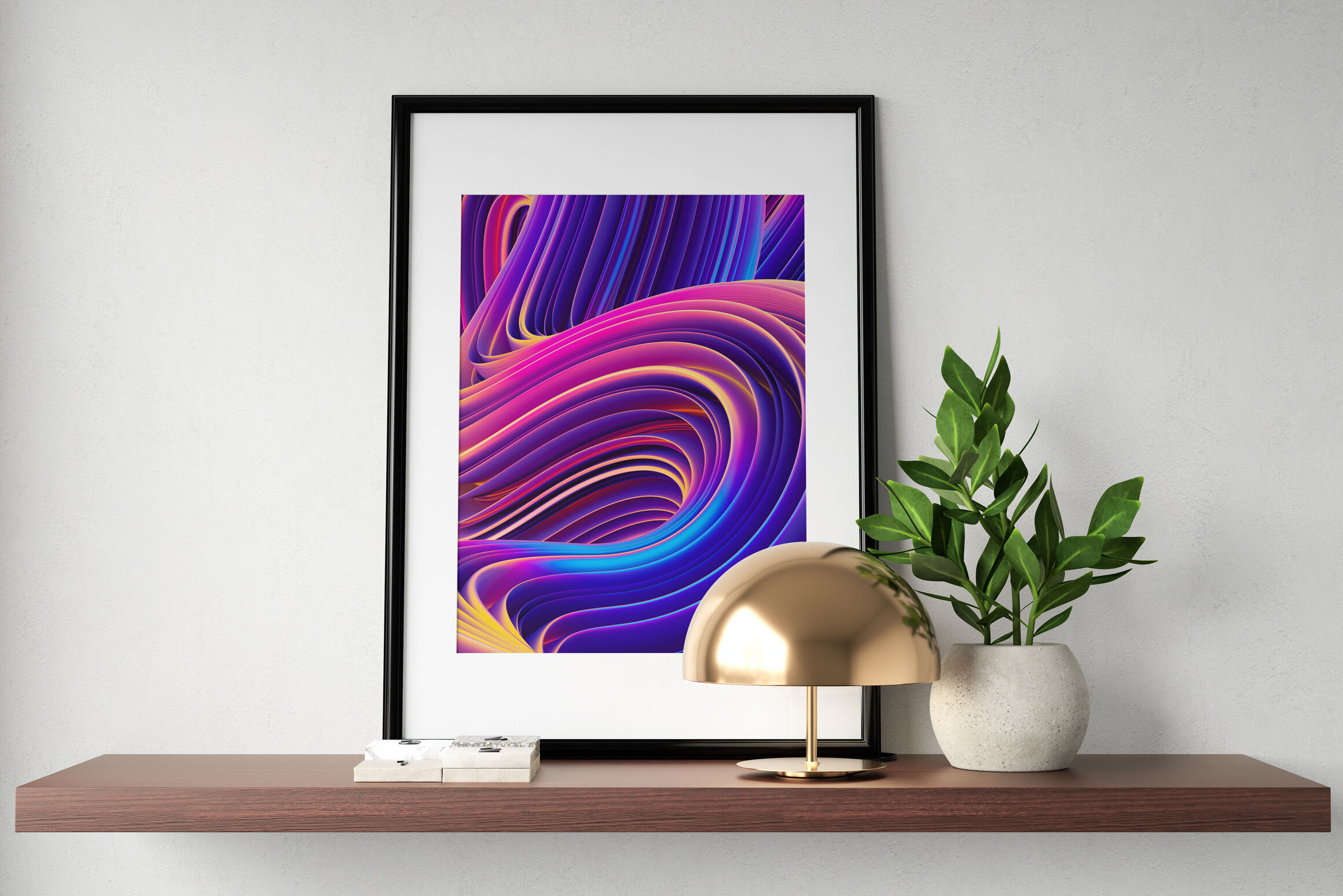
So, what if you’re looking to create vibrant designs? Opt for fluid 3D shapes in a good gradient tone that matches the style you want to create. Having a 3D gradient graphic element in your visual can bring a fun, stylish effect to the table.
Adding Text? Go Minimal
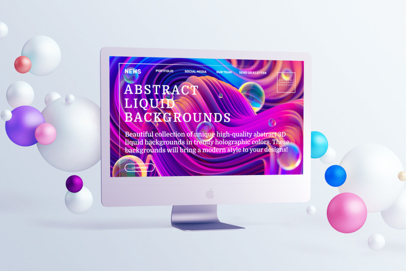
What about big banners or posters that actually require people to read the text or message you’re trying to convey? Go for these bright, 3D gradient heavy backgrounds and minimal abstract shapes.
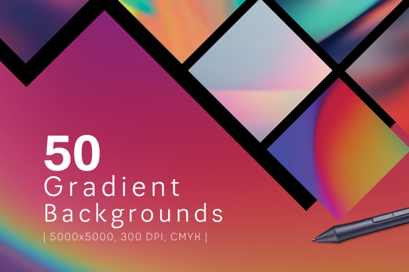
Pair it with white or other natural tones, especially if you need to add some text. This works if you have less text and are looking to have more graphic elements to accompany it.
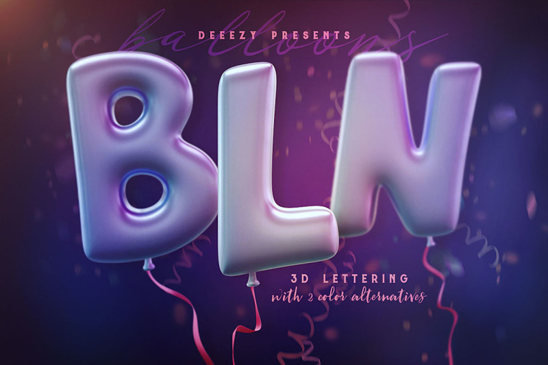
Using Text As The Main Design Focus
What if you really just want to use the text as the main focus of your visuals? By making use of a color palette – one that’s harmonious, not too contrasting to the eye! – you’ll be able to achieve that desired effect. If you note the text “Super Sale” in the visual below, you can see that it has a light 3D gradient effect, too. That helps to give the text some depth or body, and avoid it getting enveloped by the contrasting outline.
Bear in mind that using some simple shapes can help your text stand out more on a background that is comprised of a full gradient. Less is more! Make the design elements that you choose work to your advantage.
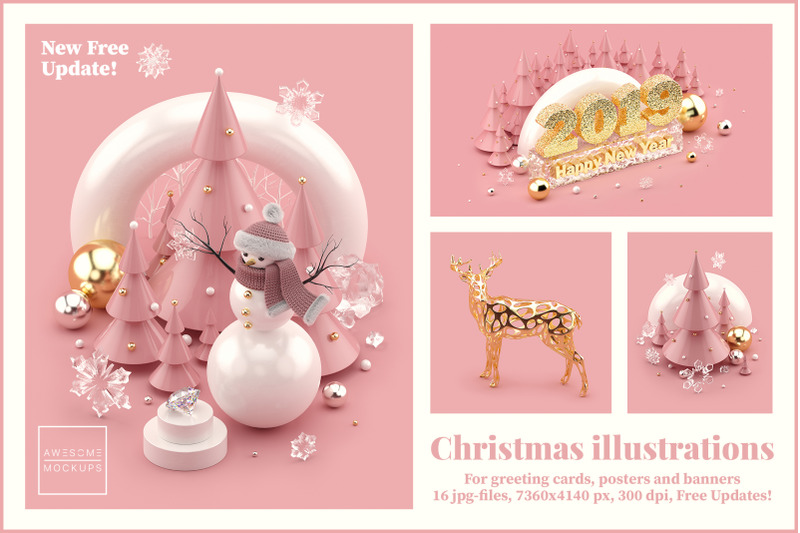
✌️ Bonus ✌️
Also, I know this is a little too early to prepare design creations for Christmas, but JUST HOW CUTE IS THIS? Definitely an illustration pack I’d want to keep in mind for making visuals at the end of the year 🙂

As always, experiment with what works best for your creative project. Whether it’s designing with text as the visual focus, or using 3D elements to wow a viewer, it’s your call! ✌️