Ever heard about the 3-second rule?
In marketing, it only takes 3 seconds for a visitor to give attention to your website or design. It mostly depends on your audience’s characteristic. If your main target audience is made up of women, it’s time for you to deepen your research. Start making your designs more feminine to attract your desired crowd. Psst… Here are 5 magic tips to get your female audience falling in love at first sight – with your designs, of course! 😉


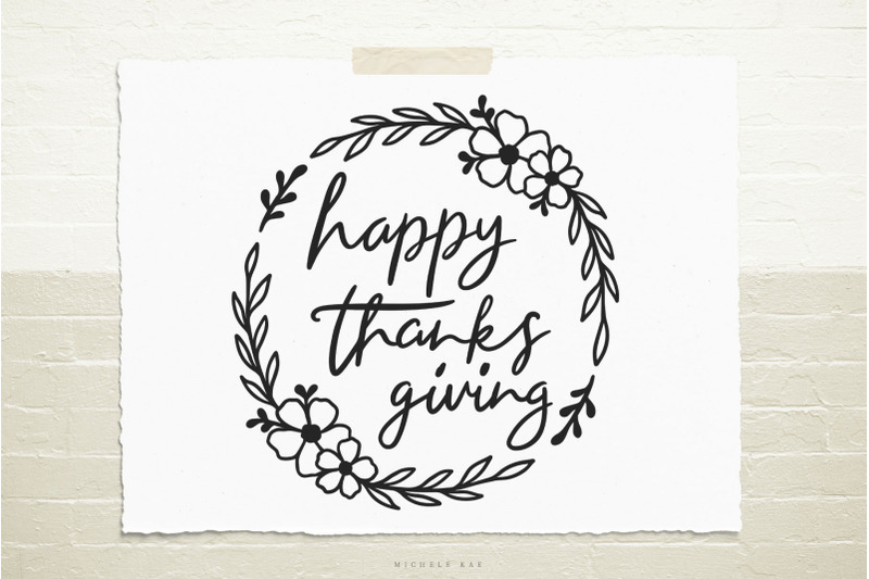
Soft, gentle, flexible yet strong, sagacious… these are all personality traits you’ll find when you ask Google about describing women. So, if you check out fonts that have soft, elaborate curlicues, flowing script with a handwritten touch – it’s easy to grasp that they were created with a feminine touch.
On one hand, it doesn’t mean you can apply scripts for handwritten themes in every female design. Overuse is never the best. Start highlighting your title and heading by artist font, script or handwritten calligraphy. For the body text, easy-to-read fonts are a clever choice. Sans serif would be a very nice choice.


“A color, a brand” doesn’t mean that you only have to use one color. If you use different colors correctly, they can still work for a brand. Here’s a fact – women definitely have different tastes when they’re in different stages of their lives. A young girl could love pastel shades for everything, from her closet to her stationery. Meanwhile, a mature woman could go for a dark red wardrobe. With this, targeting a broad female audience isn’t enough. You need more time to sit down and clarify their demographics, and which color will work for their age range.
Here’s some information we can use to reflect from a study taken by Joe Hallock in 2003 between male and female over 22 countries. This helps provide an overview from a gender-focused perspective.

Based on our research, it’s not just Joe Hallock’s study, but other researchers who also share a similar conclusion:
- Light colors go well for young women
- Adult women prefer dark colors
- Neutral tones (such as brown & grey) would be a poor choice
- Both genders like blue
- Green is more preferred by woman


Neutral tones could be a dull choice as opposed to bright and bold hues, but you can make them richer by combining them with popular colors such as soft blue or pink.

Dark colors speak of an authority of power, courage, stability and strength. If your brand targets women who have these characteristics, stick to it and find a unique way to make your brand stand!

Also, if you are a master in color combination, a mix between light and dark colors would make an awesome design. Add-on elements are a perfect match.


Quick tips to choose the right color:
- Limit your palette
- Stick with tint color
- Keep the contrast high
- Use softer tones

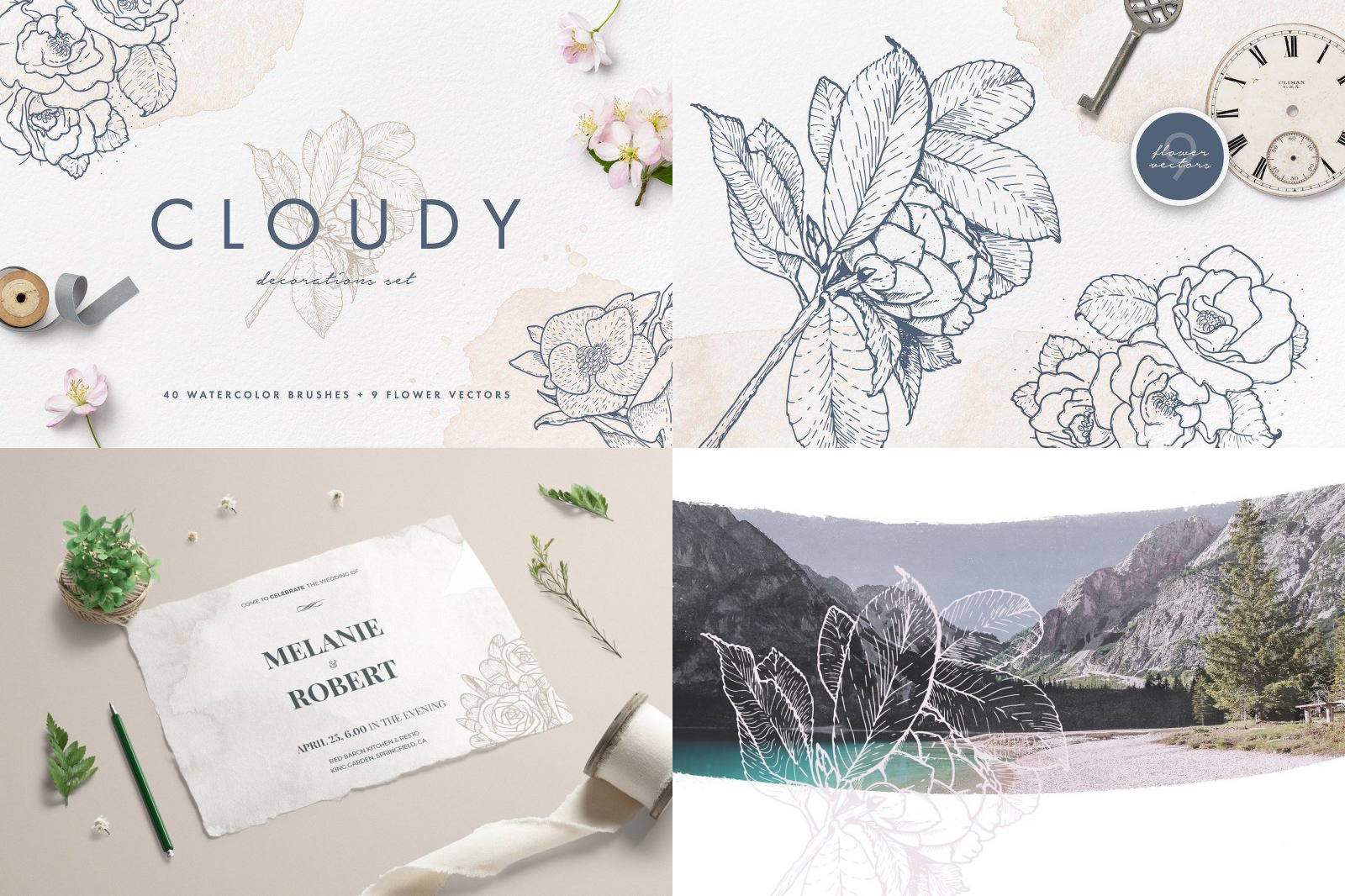
To be poetic, after women, flowers are the most divine creations. All women have their own beauty (and their own beauty standards). You get our point. Yes, putting floral visuals or elements on your design is never an out-of-date way to make a feminine impression.


Also, a combination between clipart and stock photos are a creative way to orient your brand’s visual.

Applying real flowers to your design or background is never boring. But to make it unique and fashionable, the trick is to make a bit of effort to edit and choose a suitable filter. Once everything has color harmony, you will be surprised how feminine this style can be.


With real graphic elements, the less objects there are, the more focus there is. That why you can see famous brands with headers that mostly concentrate on one subject – namely, a woman – and she would be looking at the camera. This gives the viewer a stronger impact.

On the other hand, you could just choose one central subject and make it the main focus. You may require some filters, light or dark overlays to make your photo appear more artistic. Female viewers are more likely to connect on an emotional level with these sorts of photography.

Stock images can always provide an ideal background that you can easily use to showcase your product and make it appear high-end. Graphics associated with stock photos could be a good idea to grab attention.


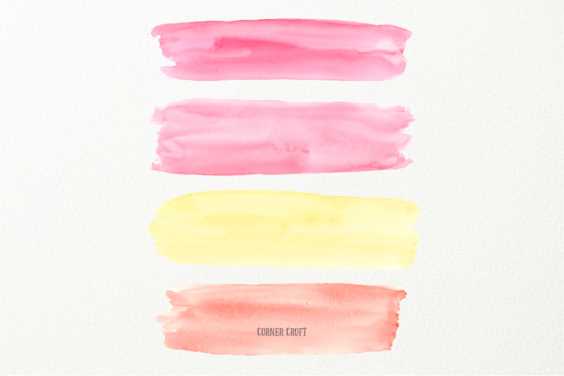
Watercolor gives viewers a gentle, calming atmosphere. With watercolor, soft tones are perfect for display. It’s all about the transparency and glow. Even glazing layers can create a nice watercolor texture. The best part about using watercolor in design? You can apply it for social media visuals, headers, web designs or layouts in general. You name it!

If you’re able to, always ask for feedback from any woman whom you think could share a similar perspective as your target audience. They can provide both subjective and objective views about your design. Good luck!