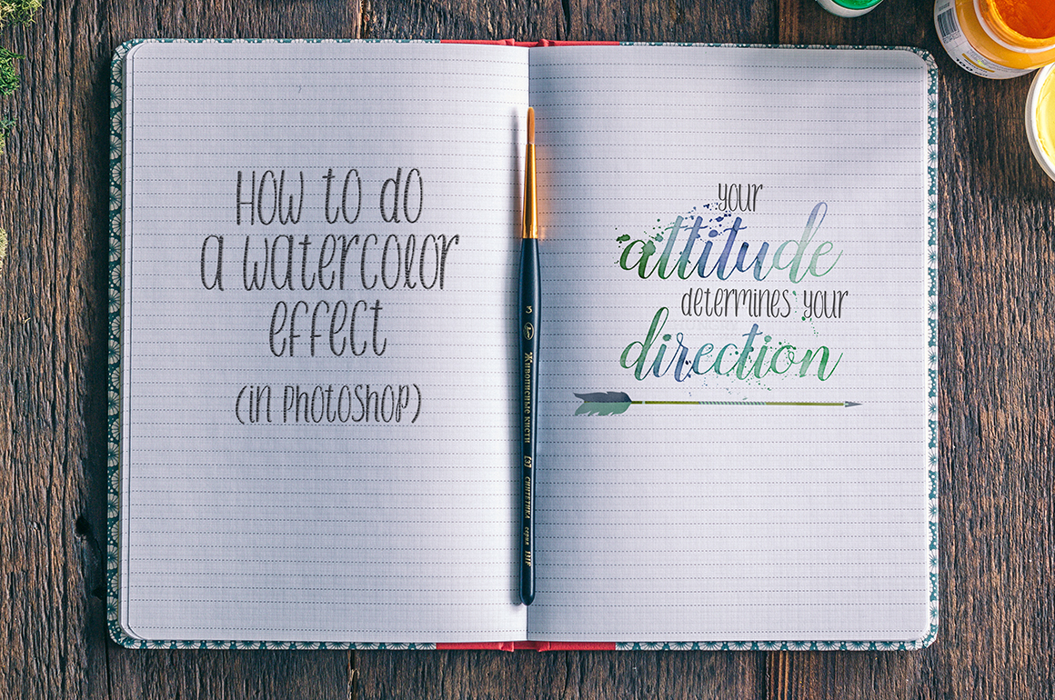
Hey guys, I’m back with another tutorial, and this time, it’s one for Photoshop.
Now, I know, I know, some of you don’t have Photoshop, or really any program for that matter. Hang tight because I’ll be covering this in a free editor soon as well, but today I’ll be focusing on Photoshop and one of my many workflows when going for watercolor.
This tutorial ranges from beginner that can at least navigate Photoshop with some instruction, to advanced as I gradually wrap up near the end. You can stop with the beginner version, or keep going. Some advance warning, as I get into the end part, I may unintentionally miss some of the breaking down in an effort to make this tutorial as uncomplicated as I possibly can but it’s gonna be a long one folks, so prepare yourselves.
You don’t have to use this on only text, you can use it on most any brush image or the premade watercolor elements you can find around and about.

To start with, for this effect, I highly recommend either purchasing or finding some watercolor textures. If you have any of our bundles, I’d say there’s a high chance you’ve got a texture or two already. Yes, you can do watercolor, to some extent without a texture, but it really makes it a whole lot easier to start with one. In my case, I’ll be using these textures by Cornercroft. Even though I’m not covering this part today, but with them being shapes, and multicolored ones at that, they really come in handy. For some of the more advanced steps, these brushes from Favete Art come in handy. And whether you’re doing beginner or advanced, using a paper texture is totally optional but it can really add a nice texture. The ones I’ll be using are right here. (I didn’t know this when I chose the texture, but as it so happens, there’s a free sample for the paper textures, and it’s actually the one I already had opted to use. So if you need a free one, there you go.) As for the fonts, feel free to choose whichever you’d like. For my own I’ll be using the free, personal use font Sandhya for this effect, and I’ll be accompanying it in my image with the free commercial use font Foxhole. (And for credit’s sake, the arrow I’m using is one I recolored from the 100 Merry Christmas elements set by Julia Dreams, which was a $1 deal previously, but is no longer available, or at least the the time of posting.)
Setting up your canvas
So first you’ll want to open an image with whatever size you’d prefer. If you’ll be following along with this tutorial, I highly recommend 300dpi. I’m using standard US size paper (8.5 inches by 11 inches) but as long as you have yours at least 8x8in at 300dpi you should be fine.
I started my image by adding a new pattern layer and choosing one of the paper textures. The image below should help anyone who needs more guidance for this step.

And then I laid out my text and the arrow I wanted to use for this message. I recolored my arrow and messed with some settings for the supporting words for the quote I chose. I made sure to do each line on it’s own layer and positioned them all tastefully. You may notice that my layers palette has the layers grouped, I work with my layers in groups a lot.

The way I do this is, once I’ve created my layers, in my layers palette I click the first layer and then ‘ctrl+click’ each additional layer I want in the group. Once I have all of the layers I want grouped selected I hit the ‘ctrl’ and ‘g‘ key at the same time (cmd and g on a Mac) and it will group them. Then I can double-click directly on the group name to rename it.
I have to stop here and confess that in my actual workflow, when I’m not recording an action, doing a tutorial, or anything similar, my layers palette can get to being a bit of a mess because I’m just clicking and moving and clicking and moving. (And flying through various keyboard shortcuts on my keyboard.) I also tend to save some groups until I’m sure I’m ready to delete them, so I do a lot of duplicating. Now, I do keep layers relatively organized, for my own sanity, but if my workflow is feeling too complicated because of how fast I move, I take a few moments to go through and organize them to get myself back on track.
Onto the good stuff
Alright, so now I have things set up and ready for me to start playing with the watercolor texture.
From here, I collapse the groups so that the layers aren’t showing, (To collapse the groups, click on the ‘>’ symbol to the left of it in the layers palette. The layers will still be showing, this is just to simplify your layers palette view a bit.) and, after clicking on the group with the text I’ll be working with, in my case, ‘attitude’ and ‘direction’, (The group being named ‘Words for watercolor’) I hit ‘ctrl’ and ‘e‘ (‘cmd’ and ‘e‘ on a Mac) to merge the group. Note: If you prefer to keep your layers smart objects, then of course you can turn it into a Smart Object instead. It’s up to you really.
Now, in a layer above this, I’m going to drag in the texture I’ll be using and then, with it selected, I’ll do the same command of ‘ctrl’ and ‘g‘ to put it in it’s own group. I know, it’s all by itself and lonely right now, but this will come in handy later! I’ll name this group ‘Watercolor Texture‘ and then, in the layers palette, I’m going to click the ‘layer mask’ icon. Once it creates the layer mask, I’ll highlight the thumbnail and hit ‘Ctrl’/’Cmd’ and the ‘i’ key to invert the mask. Then, I’ll hit the ‘d‘ key to set the colors to ‘default’, and the ‘x‘ key to switch them so that the color black is in front and white is in back.

At this point, I’m going to click the little ‘eye’ on the ‘Words for watercolor’ layer, which is the visibility, so that this layer is no longer showing. Don’t worry, it’s coming right back. Hold the ‘Ctrl’/’Cmd’ key and click on the thumbnail for the layer. This will bring up marching ants around where the text would be.
![]()
Then you’ll want to click the black layer mask thumbnail for the ‘Watercolor Texture’ group, and hit the delete key. When you hit ‘delete’ when a mask is selected, the color on the bottom left for your colors will be used. This is why it was important to have white as your background color, so that when you hit delete, it would ‘reveal’ everything within the selection on the mask. This will reveal the watercolor in whatever portions you have as white on the mask, and in this case, right where you wanted the text to be. Then, you’ll want to hit ‘Ctrl’ or ‘Cmd’ and the ‘d‘ key to deselect the pixels now, or in other words, to take away those marching ants.

You can leave whatever texture you’re using as is, but, I took a moment and clicked on the watercolor texture layer itself and added a hue/saturation layer above it and then clipped it to the texture. (‘Ctrl’ or ‘Cmd’ AND ‘Alt’ or ‘Option’ plus the ‘g‘ key to clip to the watercolor texture.) I just messed with the hue and saturation sliders after clipping it to make it so that the colors were a bit more fitting. Once I found colors I liked, I clicked both layers, hit ‘Ctrl+J’ to duplicate and then ‘Ctrl+E’ to merge them and set the blend mode to ‘multiply’ to make the colors a bit bolder. (And since the group as a whole is masked, you don’t have to worry about re-selecting anything. Whatever you change in here automatically changes the text inside the texture on its own now.)

Now, this next part is more for more advanced, so I’ll keep it quick, but from here, I hit the ‘d‘ key again, which brings the default colors black and white back, with white on the foreground, click on the mask, load up the brushes I previously mentioned and mark the mask up a bit more with some of the paint. In my instance, I took it a step further even and pulled out these splatters and used them to mask in some splatters on the same group mask. After a bit of play, this is what I came up with. It’s over the top with the splatter…y…ness…but hey, that’s part of the fun, right? Really, though, in this case, I just wanted to show that you could go really messy with this if you wanted to. I usually lean to a bit cleaner but it does give you an idea of how messy you can get now doesn’t it?

And finally…(phew, right?)
Now that you have something like what you might want, you can collapse that group, and with the group itself selected, hit ‘Ctrl+J’ to duplicate it, and turn the visibility off for your original group, click on the copied group, and, in quick succession hit ‘Ctrl+g’ and then ‘Ctrl+e’. I renamed mine ‘Watercolor Texture Merged’.

Then, either double click on the new merged layer or, with it selected, click on the ‘fx’ button on the bottom bar or the layers palette and try some of these settings. I recommend changing them about as you see fit, but this is a good starting point at the very least.


And really, that’s about all there is to it, you can add other details per your own inspiration, but you should have a pretty good watercolor effect at this point.
I’d truly absolutely love to see what your results were or what you did with it, so please don’t hesitate to comment or message me and show me.
Also, feel free to let me know in the comments if you need further help with this tutorial or if you have anything else you’d like to learn to do.
After my own tinkering, this is how mine turned out:

As usual, until next time!


