A well created logo is important for branding and marketing. Even if you are planning to run a small online home-based business, your logo needs to be designed with care. Some choose to hire a third party to design for them, as it is of convenience. But if you are low on funds, or would like to have a personal touch, why not design it yourself? As a website that sells thousands of graphic design materials, we at TheHungryJPEG have tons of products for you to experiment with, all at reasonable prices!
When designing a logo, there are a few important things that you need to keep in mind, and we decided to write a post especially for that. Got your notepad out? Okay, here we go;
5 Tips For Designing A Logo
1. Ensure Readability
It is of extreme importance to ensure that the logo or label is able to be read by the consumers. Prevent getting carried away when designing, and ensure that the design doesn’t throw off the consumers interest in your product. This doesn’t just mean the typography, but also the colours and illustrations used on the design. Check to see if they don’t clash with each other, making it hard to read the logo.
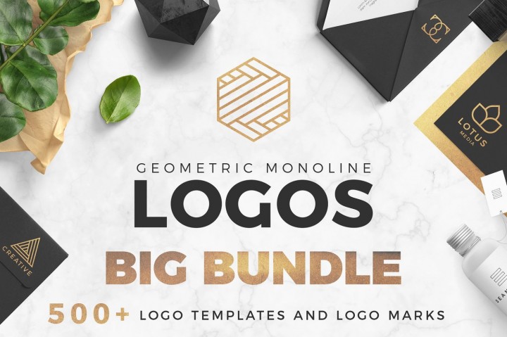
Here are some pre-made logo template sets that you can use or refer to when designing your logos. This one above has 84 pre-made vector logos to design with.
This one on the other hand, is a bit more colourful, but as you can see, the words can still be read.
2. Use The Right Font
This is a very important thing to remember, which also ties back to the readability of the logo. If the font is too generic, then it would look like you didn’t put much thought into designing your logo. But don’t go too overboard with choosing the showiest font as well, though it might work for some, but not all. Think about whether the font is suitable for your product or service. Sometimes even the simplest looking fonts are great to use.
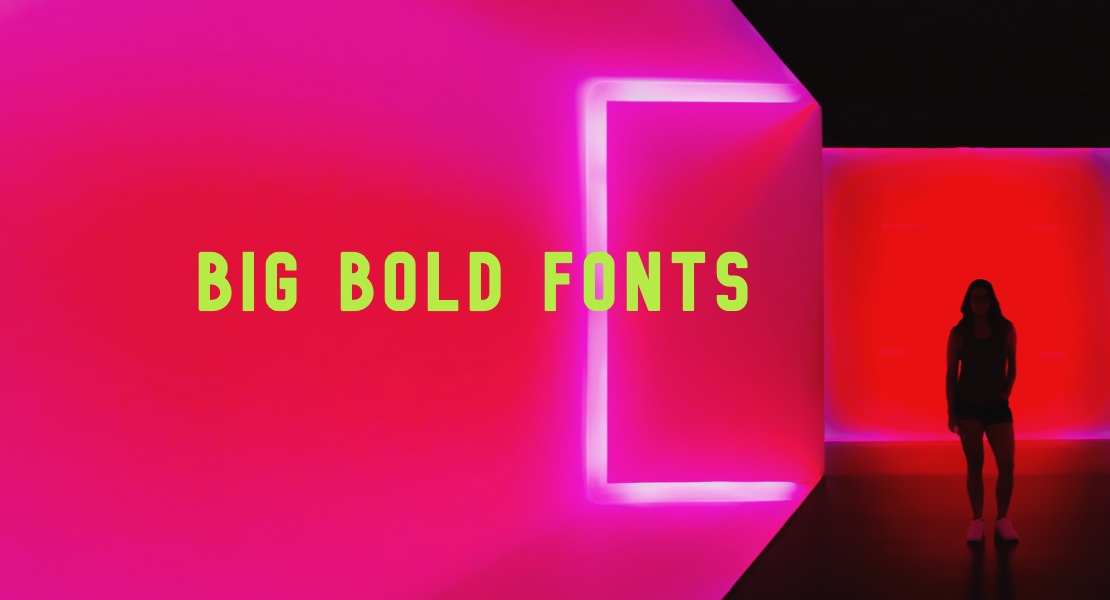
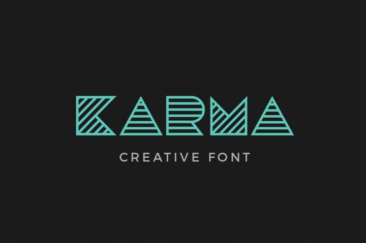
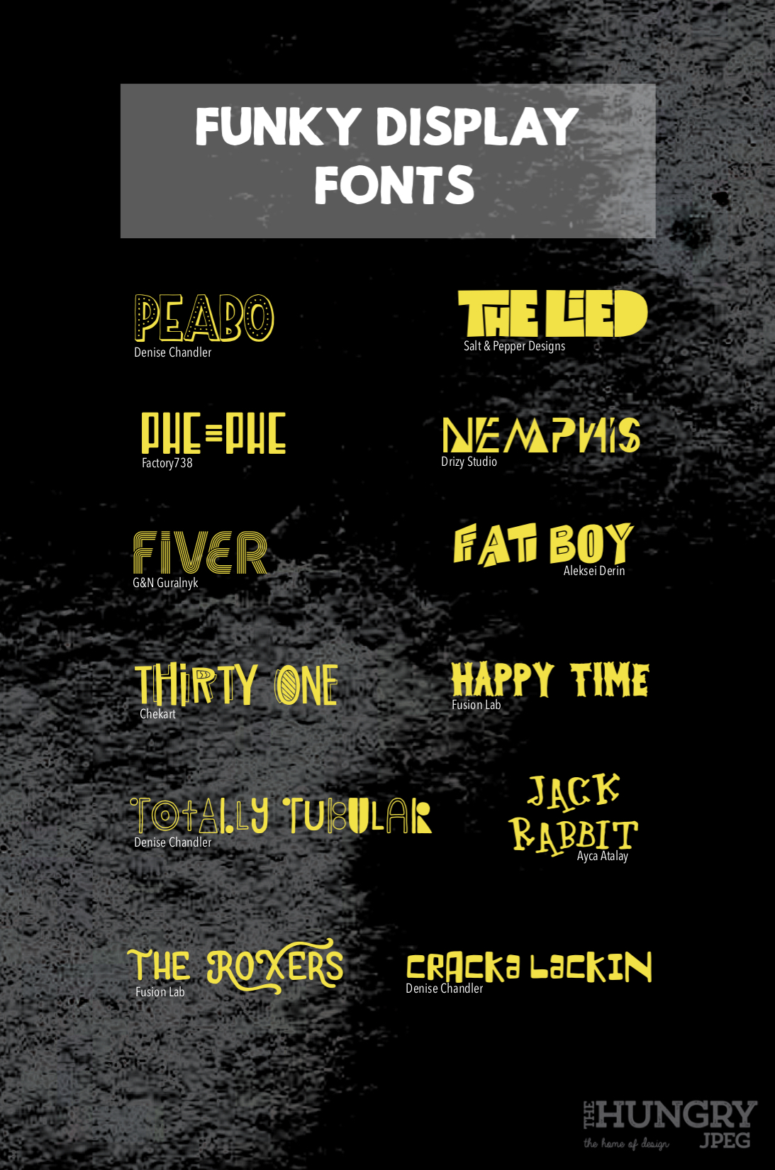
Here are some fonts that are great to use;
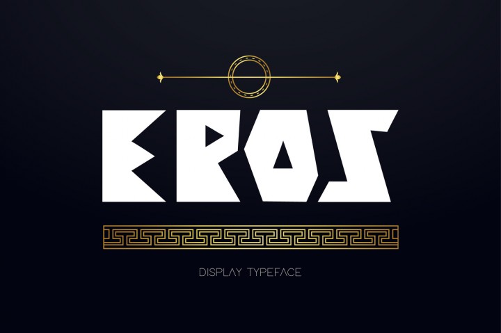
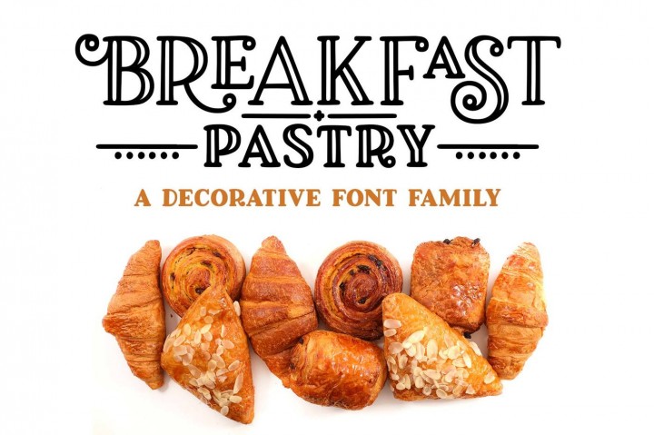
If you are planning to use more than one font, it is usually much better to use only two different fonts. Let one lead, whilst the other as a supporting act. In that way, it wouldn’t look too crowded or messy. For the leading font, you could choose to use a display type font like these below;
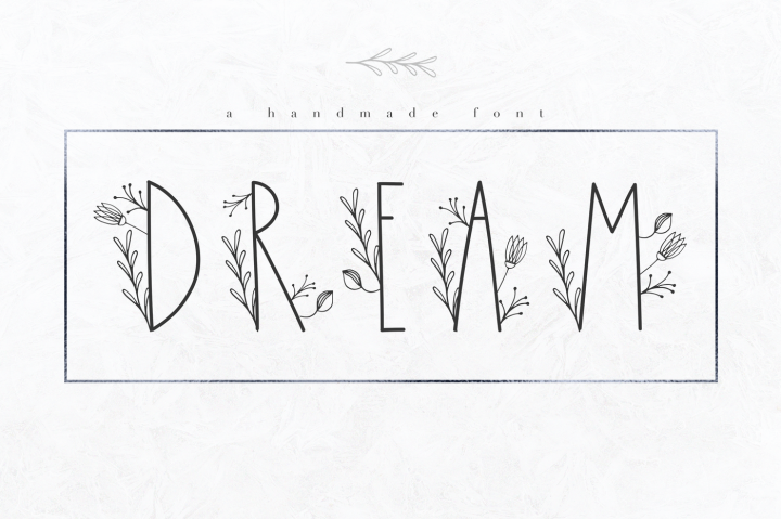
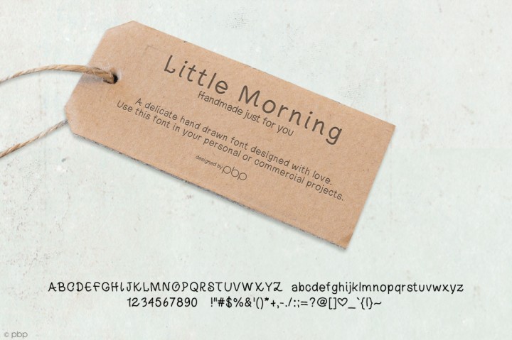
You could also check out our previous post on Display Fonts by clicking on the above image. Although, you don’t have to always use a display font. Sometimes, simple fonts do the trick as well 🙂 Check out this example below.
3. Use Graphics
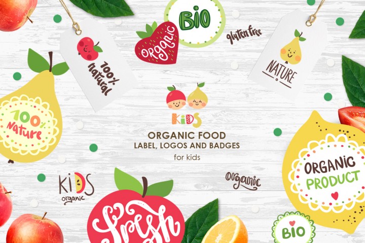
Will you be using any graphics for your logos? This is usually necessary if you need to present your brand visually. In fact, using graphics can be beneficial to your brand as consumers will be able to tell at a glance what your brand is. Icons are usually a great choice when wanting to visually represent your brand.
Recently, using watercolored graphics and geometrical shapes is trending, which is something you could incorporate into designing your logo.


Whichever it is, make sure you use good quality illustrations or graphics, as that too represents part of your branding.
4. Have White Space
Usually when getting into the flow of designing a logo, it is common to get overexcited and completely forget about the importance of white space. White space is also known as negative space, which means a part of the design that is left blank. But that doesn’t mean it can only be white. Any colour block can be used as a white space.
Why do you need white space?
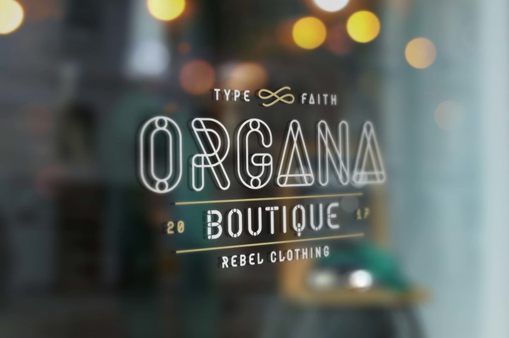
Simple. To allow the focus on the important parts of the design, and separates the prints from being too close to each other, allowing the consumers to read easily. If the logo is way too cluttered with different elements, it will be difficult for the consumer to focus on the important part of the design. You should be able to see this being carried out in most of the product headers on our site, for example;
As you can see in this product header above, the whitespace is the darkened image, which allows emphasis on the font name. With no unnecessary elements around, the font name is able to stand out easily and catch the attention of the consumer.
5. Keep it Simple
To cap it off, our last tip is to keep things simple. This again ties back to the first point, which is to keep things readable. Basically, you want something that isn’t too clustered or packed with tons of elements. If you didn’t know, simple designs make it more memorable. Think about the huge brands that exist today. Don’t they have simple logos ?
One thing you need to make sure when designing a logo, is that it carries across the brand message, values, mission and vision. In all honesty, it isn’t very easy to design a simple logo that does so. Therefore, we’ve compiled some templates that you could work with to help quicken your designing process.
These 5 tips will definitely help you on your way to create the best logo for your brand. Feel free to experiment, but remember that it needs to represent your brand.
As a refresher before ending this post, here are the 5 tips once again.
- Ensure Readability
- Use The Right Font
- Use Graphics
- Have White Space
- Keep It Simple
For more tips and tricks, do bookmark our site for future reference. If you would like to experiment with some simple fonts when designing your logo, check out our list of must have tall thin fonts. The mascot of your brand, which is your logo, needs to speak to the consumers. Logomaker uses AI technology to extract relevant information about your brand, deliver quality logo designs that are speak to the professional and look professional. Check them out if you’re looking to create your own.